Tuesday, 20 December 2011

Where Ideas Have Come From


Rihanna's 'music of the sun' album and Beyonce's 'Bday' and 'Greatest Hits' album have been big inspirations for me.

When I first drew my mock up, I think it's fair to say that it was almost a replica of Rihanna's album.  But of course when it came down to taking the pictures, things had to change.  

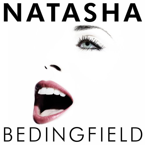
Rihanna's extreme close up image was what I wanted for my front cover, simply because it is easy, it takes a lot of space up, and it is a basic feature of an upcoming musician's first album cover.  It's not an extreme close up but this is what I plan to use.


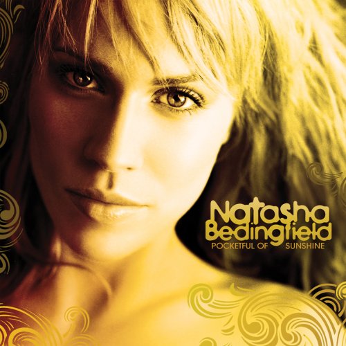
I planned to take the picture against a water background (Excel), but when it came down to focusing on the camera I was using, it was a struggle, so I thought I would make things easier for myself and go against a plain background.  The water technique was inspired by Beyonce's front cover of Bday, even though her's was the bright blue sky.


The back cover was again inspired by Beyonce's Bday album, which was a close up/side shot of her tilting her head back, and a blurred out background of branches of trees.  However, after thinking about it, I realised that Beyonce could pull this off because she is a well known artist - 'Deavian' couldn't.  


So looking back to Rihanna's album, I fell in love with her idea of her girly pose in her bellytop with the tracklist falling down one side.  Although I'm sitting rather than standing for my back cover, the idea of placing the text for the tracklist on the left side was taken from Rihanna.


The rest of my images were inspired by Beyonce's 'Greatest Hits' Album.  The full body length shot of her used on the page where she thanks her producers and everybody who contributed really stood out to me, but again because I'm not Beyonce, I had to tone it down a little and not use too much of my 'sexuality'.  She also has close ups on the rest of the parts of the digipak and that is something I plan to do, because I want my 'fans' to see as much of me as possible.


My original colour scheme was also inspired by both Rihanna and Beyonce.  Beyonce's use of the natural colours such as green and blue reinforced her simpleness, but then the use of the colour gold represented her wealthiness.  Rihanna's use of gold for her font represents how wealthy she pictures herself being, and that's a message I would like to send off as the musician. 

Gold, white and black will probably be my main colours, as the gold symbolises my upcoming wealth, and the black and white symbolise me being a newcomer to the music industry.  If possible, I would like to include green and blue in the pictures somehow, but I doubt it will work.

Monday, 19 December 2011

Photos to be used


Potential CD Cover:


it's a clear close up/midshot of me and I like how simple it is.  All eyes will be on me and that's what I want.  I'm unsure of what background it would be put up against though.

BACK COVER:


I wanted something similar to Rihanna where I'm standing up against the side, allowing the track list to be written down on the opposite side.  I'm a short girl so that didn't really work, so me sitting on these stairs give an edge to my image.  The right side of the stairs will probably be cropped, allowing the text to be placed on the left side.

1 of back covers:


I wanted something similar to Beyonce, and I want this to be my image on the page where I thank all my producers, and fans.  Beyonce's shot was a full body shot of her showing off her sex appeal, but because I'm an upcoming artist, I wanted to keep it at a plain full body shot picture.  This will be pushed to the left side, allowing the text to be placed everywhere else.

CD PLATE SHOT:


This is one of the outfits I wear in the 'Who You Are' video, but I don't want that to be obvious.  I didn't really want to include an outfit from the video, but I think it works well against the different background.  The CD plate will be placed over this picture so it's not obvious the outfit is from the video.

These are the rest of my potential shots I plan to use for the remaining parts of the digipak:


RESEARCH - Existing Digipak


3. NATASHA BEDINGFIELD
genre(s): pop, RnB,


The midshot/close up used against the gold-yellow colour scheme is symbolic of Natasha being destined for greatness, for wealth.  From the pose and the plain black and white font used, we see her as another newcomer to the music industry, and it suited her then-style.  The whole Digipak Cover leaves the audience curious as to what she will have to offer.  This is something I would like to include in my Digipak, because I think giving a little bit away from the image, is more likely to increase the sales of the album itself.


Her second studio album definately established her role in the music industry.  One side of her face is merged into the background so it pretty much looks like a floating head, and this is symbolic of people now knowing what she had to offer.  People knew who Natasha Bedingfield was, even without the distinct font on the album cover, from the picture they would of been able to tell.  


However, Natasha had an alternative cover for her North American fans.  I think this may have been because she was either more popular over there or less known.  Similar to her first album, there's a yellow/gold theme running through the album cover,  but this time we see her face from the front, and not the side - symbolic of how comfortable she is an artist now.  The font is also a gold colour representing her current wealth and/or upcoming wealth.


Total different images to make a comeback.  This is not the Bedingfield we thought we knew!

RESEARCH - Existing Digipak


2. ADELE - 19
genre(s): pop, soul, rock, R&B


Adele's first album '19' is very different to most covers.  It's against a black background, and it's a close up of about 3/4 of her face.  The lighting only hits half of her face, which allows us to see a brown fringe, the outline of her nose, and her left eye which has thick mascara on.  The font used was a simple white one, which stood out against the black background.  This was a very tricky thing to do for a first album cover, but I think Adele took this risk because she was confident in making it to a higher level.  Her simpleness also suggests that she wanted people to like her because of her talent, and not the way she looks, which is why she reveals so little of herself on the front cover.  I like the concept of the idea, but this isn't something I would do for my first DigiPak.


Adele's second studio album has a similar approach, however, she does reveal her whole face in this one.  It's a close up of her with her head tilted to one side almost falling into her hand.  It has a black and white effect again, and also has white and grey fonts.  She doesn't look in the camera again but her revealing more of her face represents how she's 'blossoming'.  It's almost as if she is a flower or a butterfly, and the more people fall in love with her, the more she has to offer.  

RESEARCH - Existing Digipak


JESSIE J' was identified as a soul singer at first, she has aspects of contemporary R&B and pop music music with hip hop influences.

1. PIXIE LOTT - TURN IT UP

genre(s): Pop, soul, R&B, electropop


The image of her on her first album 'Turn It Up' is a midshot of her looking away from the camera.  It's against a very simple grey background with a spotlight highlighting her face.  Her long blonde hair is a little bit messy to give her that 'edge' for the cover, and she's wearing a plain black tank top, with a GOLD and RED design on top of it falling against her neck.  This cover is suitable for a new upcoming artist simply because it doesn't contain too many 'flashy images'.  Also, several musicians stare directly into the camera for their Digipak Cover, but Pixie makes this work because it symbolises how new she is to the music industry, as we see her as an average 'blonde' female.  The simple white font also contributes to this. 


The alternative Digipak Cover on the other hand, shows her come out of that 'new artist shell'.  It has a midshot of her wearing very thick black eyeliner and mascara on and she's holding a very thick rope chain up whilst looking directly into the camera.  Although the image is also quite plain, the black and white effect gives it that 'icing on the cake'.  Both this and the pink font used establishes Pixie Lott as an upcoming artist ready to turn into a high-profile artist.  This is something I would like to create for my DigiPak Cover.

  YOUNG FOOLISH HAPPY


In her second studio album 'Young Foolish Happy', we see Pixie as more of a 'woman' than a 'girl'.  She again goes for the black and white effect but this time, we have a turquoise/green 'X' symbol overlapping the right side of the cover.  To me, the 'X' is symbolic of more 'X-Rated' tracks appearing in this album.  This is reinforced by her lack of clothing for the cover, as the midshot comes across as if she is naked.  The blue/green colour scheme represents how natural this is for people in the music industry - 'they never stay the same'.  Adding to that, the thin black font used again shows how she has matured in the industry compared to the thicker fonts used in her first Digipak Cover.


In the deluxe edition of her CD, we see a wide/mid shot of Pixie standing against a dark gold background.  This time the 'X' is in the middle of  the whole image and it is RED.  She is wearing black clothing, which expose her legs and chest quite alot.  Her pose is very professional, and this again just shows how she has become more comfortable with using her sexuality to 'sell', and how she has matured in the music industry.  This is not something I would go for, I don't think 'Deavian' is at that stage yet.

Sunday, 18 December 2011

RESEARCH - Importance of digipaks


Importance of Digipaks in Music industry

why are cd covers still used?

- to identify artist
- to allow real fans to support their artist rather than download illegally
- to have a connection with musician
- to allow those who prefer hard copies rather than digital copies have a hard copy

how will ancillary products will help promote the:

ARTIST: promotes image of artist, gets name around through social networking sites like facebook, twitter, through websites, magazines, interviews, etc.

MUSIC INDUSTRY: everyone wants to know well the well-known artist came from, other artists will call them to collaborate

VIDEO: promotes image of artist again, in some cases provides visual pleasure, lets fans see their artist move around rather than staring at still posters of them.  
           - sell songs, makes song memorable, helps boost promotion of films and brands maybe, establish artists images, helps promotes ALBUMS.

RESEARCH - Previous Student Work


One piece of previous student work that really stood out to me was this one:


- The simple use of close ups worked well against the plain white background.
- The black white and pink colour scheme work very well together
- The pink font used stands out and makes the name of the artist memorable

It looks like an actual Digipak, it's obvious a lot of time and effort was put into this work.

I would have loved to do something simple like this, but close up photos of me will take ages to come about.  Not as photogenic as she is.

But I LOVE THIS!

Wednesday, 14 December 2011


Here is my trial digipak.  As you can see, I have little experience with Photoshop.  Practice makes perfect :)

Friday, 9 December 2011

Previous Student work

Previous Student Work

We looked at previous student work in order to get a sense of what it we have to produce. I found this lesson quite helpful.

I analysed this students digipak and was able to find strengths and weaknesses about it;
Strengths:
Follows the colour theme through out all panels
Clear image of the artist
good colour theme
record label

Weaknesses:
different picture in every panel
Artist could been pacing straight
The font is not so clear

Strenghts:
Close-up image of artist she's engaging with the audience
Very clear font-easy to read
Good use of colour through out the panels- following a theme
Establishing artist image

Weaknesses:
No copyright
Not so much information for the audeince
This poster is very well done it shows the bands image. The audience know who are the artists. There is also similarity between their digipak.

Starting our digipaks

Why are CD covers still used?

  • To identify the artist
  • Because people still buy CD's
  • Visual media- to express the artist, people still use the image for recognition.
How will ancillary products help promote the:

Artist- Promotes the image of the artist, provides other platforms like magazines.
Music Industry- More money for the industry, more promotion which means they're selling more-reinforces the artist branding
Music video- creates a visual link to the advert

Screen on green

We watched our music video and I think it was really good considering that we started from scratch on the day of our deadline. I really enjoyed watching the videos from other groups and I think all the music videos as a whole were very good. We hope to get some feedback from students and teachers.

Tuesday, 6 December 2011

Analysis of 3 Digipak's within a similar genre as our artist

This is Pixie Lott's digipak to her self titled debut album 'Pixie Lott.' The simple layout of the digipak is effective as the image is simply her in the center of the cover with a plain grey background. It promotes her well as it is trying to establish her as a new artist. The font is white and very girly which conveys Pixie's style; girly.


Ellie Goulding's 'Lights' digipak has a strict 'lights' theme. The black and gold colour's stand out amongst the image of Ellie surrounded by golden lights. The font is simple but again, gold which blends in with the theme. The overall digipak is eye catching and gives you a clear rock-chick expectation of the album.


Eliza Doolittle's digipak is very cute and youthful. The different colour's stand out from the plain blue sky-like background. The image of her holding a giant dice suggests she is playing games, which has very child-like connotations. The font is plain and black and is in a banner which supports the theme of cartoon-like randomness. 

CINEMA responses

Cinema was great!  Our video was a success as a music video and I had fun watching everybody elses.  Below are some responses from students who gave it a review.


Questions for cinema.

1. First of all, was it clear to understand the story of the music video?
2. From your point of view what was happening?
3. Do you think the two different actresses instead of one worked well, and if so why?
4. What could we have improved on?


Monday, 28 November 2011

SCREEN GRABS


F I N I S H E D !

Last minute editing on November 28th

Once we had done the sequence of the music video we went through it and added many cross dissolve's. The reason for this is because we feel our song and the theme to our music video is complimented by slow movement and transitions between shots. 


Also, we made our vide black and while like Adele's - Someone Like You. We did this because we though it strips our artist - Diavian- of exterior beauty and focuses mainly on the message behind the video - that she is dinging to guide these lost girls with little/no confidence.

EXTENDED DEADLINE!!!!


SO, after a long day of endless panicking our teachers have extended our deadline!! Just as we were on to the last 10 seconds of our music video the whole thing went out of sync and we could not get it back in time for the deadline.


Friday, 25 November 2011