3. NATASHA BEDINGFIELD
genre(s): pop, RnB,
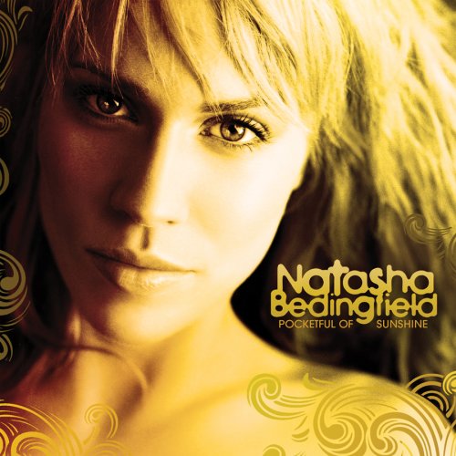
The midshot/close up used against the gold-yellow colour scheme is symbolic of Natasha being destined for greatness, for wealth. From the pose and the plain black and white font used, we see her as another newcomer to the music industry, and it suited her then-style. The whole Digipak Cover leaves the audience curious as to what she will have to offer. This is something I would like to include in my Digipak, because I think giving a little bit away from the image, is more likely to increase the sales of the album itself.
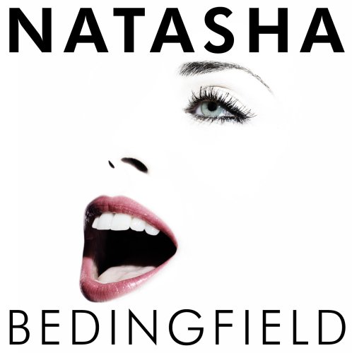
Her second studio album definately established her role in the music industry. One side of her face is merged into the background so it pretty much looks like a floating head, and this is symbolic of people now knowing what she had to offer. People knew who Natasha Bedingfield was, even without the distinct font on the album cover, from the picture they would of been able to tell.
However, Natasha had an alternative cover for her North American fans. I think this may have been because she was either more popular over there or less known. Similar to her first album, there's a yellow/gold theme running through the album cover, but this time we see her face from the front, and not the side - symbolic of how comfortable she is an artist now. The font is also a gold colour representing her current wealth and/or upcoming wealth.
Total different images to make a comeback. This is not the Bedingfield we thought we knew!


No comments:
Post a Comment