Showing posts with label Zaskia Delgado. Show all posts
Showing posts with label Zaskia Delgado. Show all posts
Wednesday, 16 May 2012
Friday, 27 January 2012
Goodbye :' )
It has come to an end! I have enjoyed this whole experience and even though at times it's been very stressful my little slogan 'blog till you drop' has kept me going. I have learnt a lot from all of this!
Good Bye Blogger : ')

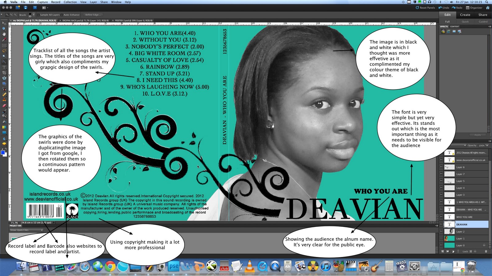
Evaluation Q4 What have you learned from audience feedback?
As it's seen many people liked our video, they thought it told a storyline very well and the verse/chorus structure was seen perfectly. However there is always room for improvement. Here are some of things people said about our video:
"I liked it because the audience is able to identify with the actress in the video, it follows a very clear storyline almost like we're following the artist Deavian through her journey. I do think you could have improved it by having a variety of shots and making the transitions flow a lot smoother"
Angie-Student
"I think the video being in black and white was good as it made it different to the rest and it complimented the storyline very well. I think the performance of the artist could have been better It could have been more natural not too staged."
Michelle- young adult(from outside college)
I also asked my teacher Louisa for some feedback, I can't remember her exact words but she said that even though we had to start editing again, we managed to produce a good piece of work. She said we made the verse/chorus structure very clear and used effective transitions to change scenes.
From the videos above I can clearly see what I could have done to improve my video. Even though we had good comments it's always good to see what improvements could of been made. Many people commented on the artists performance, they said she could have shown more emotion. I agree with this as the performance is vital for a music video to be effective. The audience tend to look at the artist performance a lot and judge them by it. They don't exactly look at the editing which is why a good performance from the artist is important. Our song had a deeper meaning which required a very believable performance in order for the audience to connect and identify with the artist. I think that If I was to the video again I would make sure the person who is performing really shows a lot of emotion by really connecting with the song.
Some people also said that there could have been a variety of shots and I agree. In fact we realised this issue after we finished filming but it was too late to film again so we had to work with what we had. A variety of shots always makes a music video a lot more effective as in some way it shows more about the artist. If I was to start filming again, I'll make sure that I get a lot of footage because it will always come in handy in the editing process. Looking back at my video I think we should have used a variety of angles low, high and side angles this prevents it from looking 'static' as someone said in our feedback.
Overall, I think that our group managed to produce a good piece of work even though we began editing from scratch on the final deadline day. We had great potential to do better but unfortunately technology wasn't on our side that week. However the feedback given to us gives me a better idea of what to do and not to do the next time I come across in doing a music video.
Thursday, 26 January 2012
Evaluation Q3 How did you use media technologies in the construction and research,planning and evaluation stages?
Technologies used
Blogger 'The backbone of my coursework' :)Here is the transcript just in case it's not clear when my little friend says it.
Oh my GOD.
 I absolutely love the way blogger has helped me show everything I have done these past few months.
 Blogger is great as it's almost like a storage where I am able to put all my ideas, inspirations or any things that have gone wrong. For example the day we couldn't film at the excel centre because it was raining or the day when filmed but it was freezing cold and we couldn't fe
 el our fingers .I think blogger is the back bone of my whole coursework as it's where all my planning, research and evaluation goes even though it can very annoying sometimes when the images you want to embed do not go where you want them. This media technology has been particularly helpful as my teachers are able to see what I'm doing and so I am able to get feedback from them.Things I'm doing well and things I should improve or add more of. I think this is the main media technology I have used and I tho
 ught it was great! GO BLOGGER!
Photoshop
Photoshop was very-very depressing at times, but I knew that the only way I would learn how to use it was by practising and experimenting with all the different tools, so I began to see what each tool was for. After Familiarising myself with the programme I found it a lot easier to make my ancillary products. I particularly used the 'magic wand' tool as I had to cut out images like the swirl patterns and Emily's image. I also used the 'paint bucket' tool to select the colour of my background. Below are some screen shots of the tools I used and what for.
Photoshop was very-very depressing at times, but I knew that the only way I would learn how to use it was by practising and experimenting with all the different tools, so I began to see what each tool was for. After Familiarising myself with the programme I found it a lot easier to make my ancillary products. I particularly used the 'magic wand' tool as I had to cut out images like the swirl patterns and Emily's image. I also used the 'paint bucket' tool to select the colour of my background. Below are some screen shots of the tools I used and what for.
 |
| This is a screen shot of my digipak on Photoshop. |
 |
| This is the inside panel of my didipak I used the layer-duplicate layer tool to duplicate the swirls and carry them out through out out the panels. |
 |
| This a screen shot of how I converted my image into black and white. Below is the picture of how it looked. |
 |
| Here is the black and white image, this helped me see if the image looked good or not. I liked the images with this effect so I used them for my final product. |
 |
| This is what I clicked on to get another image of the same photo. I duplicated the layer and so I was able arrange them the way I wanted. |
 |
| I clicked here to open up new files and images I wanted to use. |
 |
| This is the toolbar on photoshop. I clicked on different tools to experiments with the effects it made. I particularly used the magic wand tool, the rubber tool, text tool and colour bucket tool. |
Viola
My teacher suggested I use 'Viola' to annotate my digipak. I wasn't sure how to use it but I taught myself and I found it was a good media technology to analyse in detail the digipak. This had helped in the evaluation stage of my coursework. I have really been able to see what things I have done right and how I could improve it.
Here are some images of what I have done.
 |
| Using Viola |
 |
| Analysing inside panels on viola |
The Animatic
This is our animatic, we took several pictures and placed them on final cut pro alongside the sound track of our song which then became a small video clip.
More Technology I used
Evaluation Q2 How effective is the combination of your main product (video) and ancillary texts (digipak and advertisement)?
Our music video


Here is a small booklet I made, with notes to help answer this question


 |
| Analysing my front panel on Viola |
 |
| Analysing my inside panel on Viola. |
I stuck images on my wall to illustrate my analysis between my ancillary products and to compare them to existing digipaks.

Answering question 2 : )
Saturday, 14 January 2012

Friday, 13 January 2012


Thursday, 12 January 2012
Production of Ancillary Work
Using Photoshop!
Digipak
Digipak
To be honest I dislike Photoshop because it's SO stressful! However I think it's a very good programme when designing something. There isn't anything Photoshop can't do! A LOT of practice is needed with this programme in order to make a good product.
Here are some screen shots showing my development:
 |
| I used the bucket tool to change the colour of the the background I then selected the colour tool to choose the colour I wanted. |
 |
| This is the swirl design I decided to use. I opened it up in Photoshop and use the 'magic wand' tool to cut out all the white areas so that the black swirl was left on it's own. |
 |
| This shows how I have changed the image to black and white. I clicked on 'enhance' then on 'convert to black and white' near the bottom. |
 |
| This is the front panel of my digipak, I have changed the colour to turquoise . I have also added text to the front with the 'text' tool on the tool bar. I box appeared and I began to write what I wanted then I highlighted it to change the font. |
 |
| This is the inside panel of my digipak. To draw the circles I selected the 'shape' tool and drew the shape to the appropriate size. |
 |
| I then began to add some of the 'swirls' on the inside panel in order to show continuity of my theme. I asked the teacher whether there was a way of coping and pasting one whole line but it wasn't possible so I added one by one creating horizontal lines. |
 |
| Here is the finished piece over all there was 118 layers. |
 |
| As seen here, the circle of the CD has slightly disappeared in the background. I done this with the 'opacity' tool on the left hand side. |
 |
| Here I have begun to add more swirls on the right panel to show my on going theme from the front panel. Just like mock-up idea. I have also added another image of Emily (artist) looking up at the swirls and holding out her hand almost as if to receive them Advert To do my advert I opened a completely new file (A4 Paper)  |
Planning Ancillary Products
Mock Up of my Advertisement
Here is a mock up of my advert, I labelled everything I intend to do.
Here is a mock up of my advert, I labelled everything I intend to do.

Planning Ancillary Products
Mock up of my Digipak
 |
| This is the inside panel of my digipak and my ideas |
 |
| This is the front panel of my digipak |
Planning Ancillary Products
Photos I plan to use on digipak and advertisement
I've chosen to use some these pictures because they show the artist very well, they are also clear and not out of focus which was one of the 'donts' in the list given to us. I didn't want many images of our artist looking away as I wanted her to have an immediate connection with audience.
 |
| I have chosen this image as a potential image to go on my digipak as it's very clear and she's looking directly at the audience. However her eyes not as engaging as I would like them to be. |
 |
| I told Emily (artist) to position herself in this way because I wanted the pattern of 'swirls' running across her arm |
 |
| I really like this image because it has a more 'soft' feminine look which is something I want to show through my album cover. Her eyes in this image are a lot more engaging than the previous close- up. The way her shoulder is showing reinforces my the feminine look a would like to portray. |
 |
| In this image I told Emily to look up because I thought of n idea of swirls descending and her looking up at them. Her arm is also place out so that she could be holding something. |
 |
| I want this image for my advert because she looks very feminine which once again contributed to my idea of showing her as a 'soft' artist. |
Planning Ancillary Products
DO's and DON'T's

When learning about the different conventions a digipak and an advert contain we came across some things not to do and things that were necessary to do in order to create good ancillary products.
Do
When learning about the different conventions a digipak and an advert contain we came across some things not to do and things that were necessary to do in order to create good ancillary products.
Do
- Use clear fonts
- Use appropriate size for images and font
- Use clear photos that are in focus
- Use photos that are an appropriate shape for the page
- Use a layout that follows the rule of thirds for composition
- Use an appropriate type of face that follows: genre conventions and a house style
- Be careful where you place the font. It must follow genre conventions and it needs to be clear from a distance
- Follow the conventions of the 3 colour rule and use of colour that is appropriate for: images, font and background
- Think carefully about how you use and integrate: font, text, language and image
- Use appropriate industry logos and conventions, properly positioned: barcode, date, copyright, titles and artist name
Don't
- Stretch images, this will make them out of focus
- Use layer styles
- Use unnecessary effects. Any effects used MUST suit the genre
- Place text across the artist's face
- Use a font simply because you like it
- Feel you need a separate photo on every panel 'be creative'
After reading this, I felt a lot more confident in making my ancillary products as I now had a better idea of what to do. I knew what things to avoid doing and how I could get some extra marks. I think this was very useful for everyone.
Planning Ancillary Products
Where ideas come from.
I was strongly influenced by Rihanna's'good girl gone bad' album cover. I like the font and colour used as they are very clear for the audience to see. I think the colour that is used is very good. I wish to use similar colours in my digipak. I was also inspired by Rihanna's 'Loud' album. I've shown it in a previous blog.
 |
| Whilst looking around on the web I knew that I wanted a theme of swirls going across the panels of my digipak. I saw this CD cover and I thought it would work very well with my colours scheme. |
 |
| The image of Rihanna in black and white inspired to make the image of Emily also black and white. |
 |
This close-up of Rihanna inspired me to also have a close-up of my artist. However I would like Emily (artist) to be looking directly at the camera so she's engaging with the audience. Rihanna does not do this as she's already a very well known artist. For my advert I was also inspired by this image of Rihanna. She uses exactly the same image of her on the advert. The poster is very simple but yet very eye catching. |
Subscribe to:
Comments (Atom)