Digipak Ideas
Looking through the internet for ideas for our didgipak, I noticed that most of them has a close up the artist as the main image. This is defninelty to promote the artist and as this is our task I'm think of doing the same.
Here is an image of Riahnna's digipak- Loud:

We can see how she's the main focus, the front cover of the digipak has no background the extreme close up of her face shows how she's the artist. I also noticed how the graphology is very simple which is a positive thing as it does not take away our focus from the artist. When we begin to do our digipak I hope to do something similar. For me the artist needs to be the centre of attention in order to promote and advertise them.
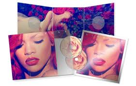
Inside the digipak, there is a particular colour theme of red, nude, white and black. The colours used are also very important as it's a way of sublimanely attracting the audeince. The colours combine very well with her hair and lips which is very effective as it almost establishes her image of being 'girly,sassy but also quite cheeky '.
No comments:
Post a Comment