HAIRSTYLES
Between my three products my hairstyles vary quite alot. In the music video there are two different hairstyles, and between the advertisement and the digipak, there are four different hairstyles. I think this works well between all three products as it makes it look more authentic for a female artist especially. Several artists tend to have different types of looks as time goes on: for example Rihanna (below)
The different amount of hairstyles is symbolic of the different hairstyles girls like to try out from as young as age 13. I believe this is a very good visual link between the three products as it reaches out to the target audience in a very subtle way.
Example, a young girl might think Deavian looks pretty on the album cover and because of that she goes to buy it.
As I've just mentioned, I believe that all three of my products were successful, in terms of how well they work together.
My advertisement and digipack had a very similar colour scheme - the pink/white background, and the black and gold font colour. The pink was to attract my target audience, as most girls like the colour pink and the gold was to represent upcoming wealth.
I feel that both products succeeded as it is quite easy to tell what genre I'm under, or in this case that I'm a mix of genres: R'n'B, Pop and Soul. I believe I followed the 'rules' and conventions of other R'n'B/Soul digipak covers as well as interpreting my own ideas into it too.
An aspect of my music video that links with the digipak is the outfit that was worn (picture on the right below). It isn't that obvious to tell that it was worn in the video because the picture is in colour, but I wanted to wear the same outfit for one picture to let my first single be remembered.
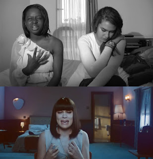
I also feel that I portrayed myself in a good way in my music video, again in terms of genre. My clothing and body language were two of the most important aspects of the video. In terms of body language, hand gestures played a really big role aswell (in the music video only).
(Below is a sketch about my hand gestures)
(Below is a sketch about my hand gestures)
(Below are my hand gestures mapped against Jessie J's)
 |
| Really feeling the music and the closed eyes also show this |
 |
| Pointing to the audience trying to keep them engaged and focused |
 | ||||
| Hand gestures again just show emphasis and make the performance look more lively |
When I first looked through the fonts on Photoshop, I thought it was going to be a struggle to find my ideal font. Because of Rihanna's font for her album 'Music of the Sun', I knew I wanted a type of bubbly font, but I wasn't sure exactly which one I wanted to use. After some searching, I came to realise that there was none that matched my ideal font that looked good against my image.
But then I came across 'Dirty Headline'. It wasn't my ideal font, but it seemed to work very well, and that of course was what I was concerned about. It's boldness also made it stand out very well. The font also has very small holes which are hard to see, but I thought this would be perfect for symbolising the 'missing pieces' Deavian has. Hopefully my three products help relocate the missing pieces for Deavian to be complete.
For the other texts like the 'deluxe edition' and the copyright information, I stuck to the simple font 'Arial Narrow'. They don't really require much attention so wasting time looking for a special font for them would of been quite pointless. However, they are important, so putting them in a nice and simple font makes it easier to read.


No comments:
Post a Comment